Sign up for the Slatest to get the most insightful analysis, criticism, and advice out there, delivered to your inbox daily.
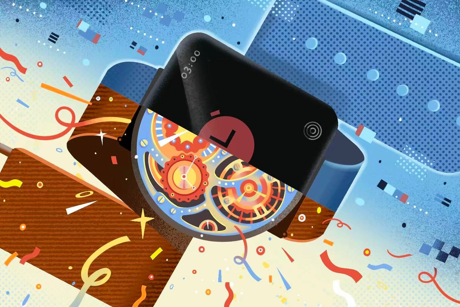
Twenty years ago, I stumbled across a book that would change the course of my career. Donald Norman’s The Design of Everyday Things, the scripture for user-experience designers, transformed how I saw the world around me. He decried the ills of a poorly designed world: the famous “Norman doors” that we pull when we should push; baffling control panels that enable catastrophe; digital watches with identical buttons that aren’t intuitive to use.
I built my career around this worldview, stepping into roles directing design programs at two different universities. Each semester, I would take my students to study frustrated users’ attempts to figure out the D.C. Metro kiosk, which offers the supposed convenience of paying public transit fare to a machine. There was confusion over which buttons to press as they wrestled with the mystery of how to reload a SmarTrip card—all of it intensified by the prospect of missing their train. Usability felt like the obvious answer. If designers understood the hurdles that users faced, they could reduce the friction between intention and action by making the machine intuitive to use.
Today, as a professor in an immersive media design program, I still teach usability as one principle among others in building robust and meaningful interactions. I once believed that it was, without question, the most important one. The consensus among scholars and practitioners in design is nearly unanimous: Usability is one of the cornerstone achievements of our society over the past century. It has allowed us to translate an increasingly complex world into tools that anyone can understand and apply. It made our technological world accessible, inclusive, and humane. Usability smoothed over the frustrations of a world full of friction.
I believed this story wholeheartedly. I don’t anymore.
The problem isn’t usability itself; it’s what it has become—a design approach that replaced any need whatsoever to understand complex systems with the ability to thoughtlessly interact with them. In my recent research on the history of design, especially the rise of industrial design, I started noticing a troubling trend: Across the past century, we have become more and more disconnected from how our technologies function. Instead, we are working literally at the surface. We’re tapping digital buttons that now stand in for physical buttons that once stood in for a mechanical method for interacting with a complex system. We’re layer upon layer (upon layer) removed from exerting agency directly in our complex world.
To be clear, user-friendly design and usability principles have indeed transformed the world for the better in many ways, and to an incredible degree. Cliff Kuang and Robert Fabricant open their book User Friendly with the cautionary tale of the Three Mile Island nuclear disaster. They note that the main culprit was a “catastrophically bad control-room design” where workers “were unable to understand what was going wrong.”
User-friendly design can save lives by allowing for legibility and shared understanding, making it safer to run nuclear power plants, air traffic control towers, and robotic surgical systems.
User-friendly design also paved the way for innovation. You’re reading this article on a digital tool built on the foundation of making a complex technology accessible for billions of people. You might be sitting in a chair or at a desk that was created using the principles of ergonomics or human factors, fields that emerged out of a concern for usable tools for a range of bodies. Indeed, if you’re listening to this on a screen reader, you’re enjoying digital accessibility, which was built on the foundation of usability for those with disabilities.
I teach these histories and champion these gains. But somewhere along the way, usability escaped these original mandates. What started as a technique to support human understanding in the face of increasingly complex tools became a way to replace human understanding. Ease became an unquestioned good. Complexity became something to hide.
A core argument of user experience (UX) design is that the interface should disappear and become intuitive to use. Intuitiveness is often achieved by hiding complexity, and hiding complexity means that users never have to encounter, or question, what’s happening behind the scenes.
That opacity has consequences. When we trust systems we can’t see into, we lose the capacity to recognize—let alone resist—how they’ve been built to shape our behavior. This was echoed in the recent court rulings against Meta and Google: These platforms were negligent not due to the content on the sites, but because of how the platforms were engineered to maximize engagement and hold our attention at all costs, thus keeping users—especially children—from ever wanting to look away. Frictionless design has helped usher in technologies that manipulate behavior in ways that aren’t always visible to us.
And we feel it. We’re detached, alienated, and disconnected. The smooth, frictionless surfaces of user-friendly design haven’t delivered the satisfaction that we were promised. Instead, they’ve made it easier to stop paying attention to what’s happening behind the scenes. While usability and UX design have given us tools that were meant to empower us—translating complexity into beautiful and intuitive interfaces that put us at ease—too often they have, in the end, trained us only to disengage.
The result is a world surrounded by frictionless experiences that mask systems that we neither understand nor control. We have become fantastic at interacting with surfaces, all while our data is harvested and our attention monetized behind the veil of user-friendliness. In this context, opacity feels comfortable and commonplace.
It’s no surprise that a groundswell of resistance has emerged from some fascinating places: from repair cafés that give people a deeper knowledge of how their technologies work (and how to hold on to them longer) to the resurgence of film photography and other tangible media among a generation that grew up with nothing but frictionless digital tools.
This is what author David Sax has termed “the revenge of the analog.” “I can only do this”—he makes a swiping gesture with his hands—“so many times with so many things,” Sax says in a TV segment. “Everything is in that one little screen, and so as individuals, as consumers, as a society, we crave things that are real and tangible.”
The revenge of the analog—through the popularity of Moleskine notebooks and letterpress cards, through the revival of film cameras among Gen Z—comes down to something more interesting than simple nostalgia. These objects demand something of the user; and in demanding it, they engage us in a way that feels lost in our era of digital interfaces. Sax argues, “That desire fits this very base desire as humans, which is to touch things, to interact with things, to buy things, to do actual things outside of our screens.”
We have all been conditioned for objects to work intuitively and instantly. The usability consultant Steve Krug captured this expectation in a single phrase that became gospel for a generation of designers: “Don’t make me think.” “As a user,” Krug argues, “I should never have to devote a millisecond of thought to whether things are clickable—or not.” This logic was eventually applied far beyond web design to nearly every interface users encounter in daily life.
This design philosophy makes sense for surgeons and air traffic controllers and nuclear power plant operators, but when the path of least resistance becomes the default for all aspects of life, difficulty looks like a bug in the system. Expertise is replaced with prompt engineering. Learning curves disappear, and with them goes the satisfaction that comes from doing challenging things.
Similarly, modern design—particularly in the hands of masters like Jony Ive, Apple’s longtime chief designer and the creator of the minimalist aesthetic for the iPhone and Mac—has moved toward objects that appear hermetically sealed, their interiors inaccessible to the average user. In pursuit of aesthetic purity, these designs erase any trace of human labor or the complex mechanisms beneath the surface. Such seamless technologies teach us that repair and understanding is not our role and that such proficiency and knowledge is unnecessary.
Psychologists are increasingly finding that such a frictionless life comes at a cost. Researchers like Aidan Campbell, Yiyi Wang, and Michael Inzlicht, psychologists at the University of Toronto, show that exerting effort increases meaning and well-being. We give more value to products and experiences that require us to work and to give active participation. This is sometimes referred to as “the IKEA effect”: We often value the furniture we build ourselves more than the identical piece assembled on our behalf. Applying this to the era of generative A.I., Campbell and colleagues had some participants in a study use ChatGPT to complete a writing assignment, and had some forgo help from the tool. The results clearly pointed to writers walking away with greater feelings of satisfaction and competency, as well as a more meaningful connection to their output, when they worked through the craft without A.I. assistance.
As designers, we’ve paid abundant attention to user frustration over the years but have ignored the frustrations that come from a smooth and too-easy world. We should pay attention to what makes practices like film photography so appealing in a digital age. Why are millions of viewers following along with antique watch-repair videos and learning the craft themselves? What’s going on with the obsession with reviving archaic occupations, like learning from artisans fixing old shoes?
We need experiences that involve our bodies in full ways. We want to feel capable. Designers need to pivot: Difficulty and complexity are not the dirty words we thought they were.
The solution to this problem may lie in the notion of seamful design. First championed in the 1990s by Mark Weiser, chief technologist at Xerox PARC who coined the term ubiquitous computing, seamfulness deliberately reveals a system’s boundaries, limitations, and inner workings. It resonates more with the progress bar instead of the buffering icon.
Seams open up opportunities for agency. They build in operational transparency, which allows users to peek behind the curtain and be a part of how something works, not just a recipient of it.
Donald Norman anticipated this, warning against designers who would mistake simplicity for good design. Writing in his 2010 book Living With Complexity, he offers an example plucked right out of the rise of the artisanal-coffee movement of the era: a complex vacuum coffeemaker, the complexity of which is its primary appeal. “For the coffee-lover, the intricate ritual of coffee preparation adds fun and pleasure to life,” he argues. “The real problem,” he continues, “is that we truly need to have complexity in our lives. We seek rich, satisfying lives, and richness goes along with complexity. Our favorite songs, stories, games, and books are rich, satisfying, and complex. We need complexity even while we crave simplicity.”
If we want experiences and technologies that feel meaningful, tools that make us feel like agents instead of alienated users, we’ll need to return to something designers once knew: Difficulty and transparency, thoughtfully shaped, can empower us and make us feel more connected. Such a shift is vital at this moment in history, when so much of modern life is designed to ask almost nothing of us.